CSS Transitionで作る状態変化アニメーション②
transitionプロパティはショートハンドプロパティ(まとめて指定できる特別なプロパティ)です。個別のプロパティを使うことで、さらに詳細なアニメーション設定が行えます。
-
transition-property -
transition-duration -
transition-timing-function -
transition-delay
それぞれ、どのようなプロパティなのか順番に勉強していきましょう。
transition-durationプロパティ
transition-durationプロパティはトランジションによるアニメーションが完了するまでの時間を秒数(単位はセカンドを示すs)またはミリ秒数(単位は1000分の1秒であるミリ・セカンドのms)で指定できます。transition-propertyプロパティと組み合わせるとプロパティ毎にアニメーション時間の指定ができます。
transition-durationプロパティ単体で指定することもできますが、transitionプロパティで指定することが多いのでこちらを使った指定方法で解説していきます。
<button class="transition-duration">Text</button>
<button class="transition-duration2">Text</button>
/* 共通のスタイル*/
button {
  width: 300px;
  background-color: gray;
  padding-top: 15px;
  padding-bottom: 15px;
  color: #fff;
  border: none;
}
/* ホバー時のスタイル*/
button:hover {
  background-color: black;
}

.transition-duration {
  /* 時間 500ミリ秒の指定 */
  transition: 500ms;
}

.transition-duration2 {
  /* 時間 1秒の指定 */
  transition: 1s;
}
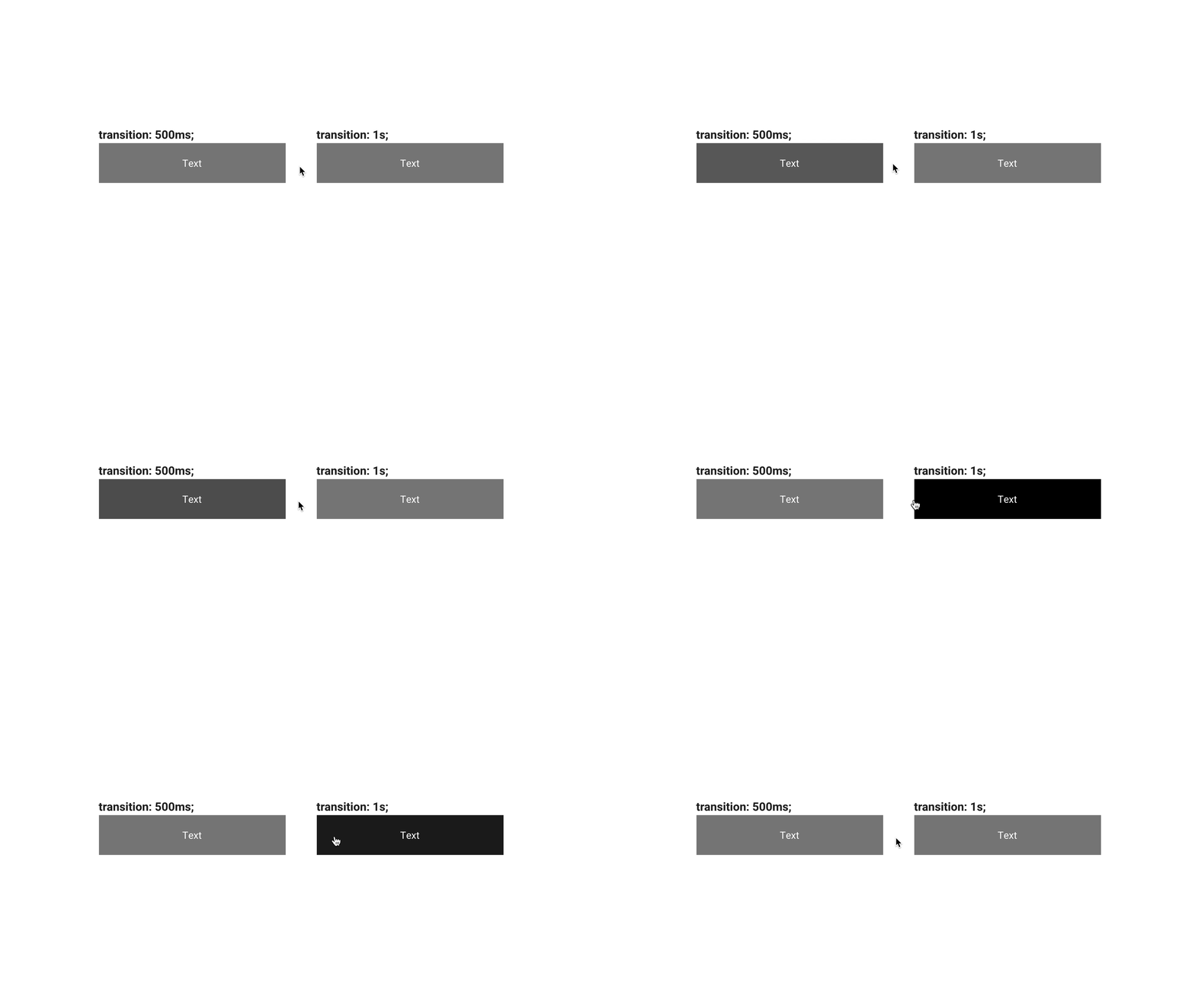
指定した時間でアニメーションされることが確認できます。
transition-propertyプロパティ
transition-propertyはどのプロパティにトランジションを適用させるかの指定です。ここで指定したプロパティが、トランジションによりアニメーションします。transition-propertyプロパティは複数指定も可能です。
<button class="transition-property">Text</button>
<button class="transition-property2">Text</button>
<button class="transition-property3">Text</button>
/* 共通のスタイル*/
button {
  width: 300px;
  background-color: gray;
  padding-top: 15px;
  padding-bottom: 15px;
  color: #fff;
  border: none;
}
/* ホバー時のスタイル*/
button:hover {
  width: 500px;
  color: #00BDFF;
  background-color: black;
}

.transition-property {
  /* プロパティ指定 | 時間 すべてのプロパティがアニメーション*/
  transition: all 500ms;
}

.transition-property2 {
  /* プロパティ指定 | 時間 背景色のみがアニメーション*/
  transition: background-color 500ms;
}

.transition-property3 {
  /* プロパティ指定 | 時間, プロパティ指定 | 時間  文字色、横幅がアニメーション*/
  transition: color 500ms, width 500ms;
}
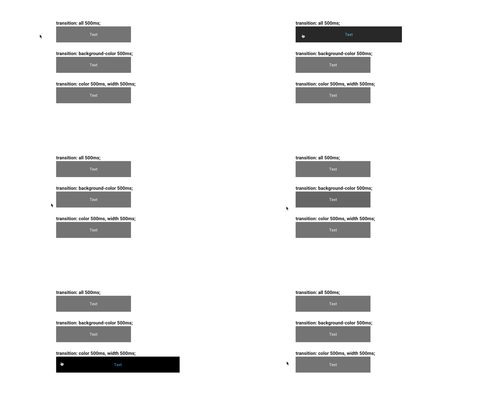
プロパティを指定したものは、そのプロパティのみがアニメーションしているの確認できます。allと指定することで、トランジションが可能なすべてのプロパティがアニメーションします。
また、transitionプロパティでtransition-propertyプロパティを省略すると初期値であるallが指定されるので以下のコードは同義となります。
.transition-property {
  /* プロパティ指定 | 時間 */
  transition: all 500ms;
}

.transition-property {
  /* プロパティ指定を省略するとallが指定されるため、この書き方でも上記と同じ動きになります。 */
  transition: 500ms;
}
allの指定は便利ですが、意図しないプロパティもアニメーションしてしまう可能性があります。個別に指定すれば、意図しない動きを防ぐことができます。どちらを使うべきかは決まりはありませんが、アンケートでは、個別に指定する方が4割で、allを指定する方が2割でした。
transition-timing-function
transition-timing-functionプロパティはイージング(動きの加減速)の指定です。定義済みのイージングや、cubic-bezier()関数で独自のイージングを指定することもできます。 定義済みのイージングには以下のような種類があります。初期値はeaseです。
ease: 加速してから大きく減速。メリハリのある印象ease-in: 徐々に加速する。加速するような勢いのある印象ease-out: 徐々に減速する。変化の余韻が残りやすい印象ease-in-out: 加速してから減速。easeよりメリハリの弱い印象linear: 等速で変化する。のっぺりとした安定した印象
<button class="transition-timing-function">Text</button>
<button class="transition-timing-function2">Text</button>
<button class="transition-timing-function3">Text</button>
/* 共通のスタイル*/
button {
  width: 300px;
  background-color: gray;
  padding-top: 15px;
  padding-bottom: 15px;
  color: #fff;
  border: none;
}
/* ホバー時のスタイル*/
button:hover {
  width: 500px;
  background-color: black;
}

.transition-timing-function {
  transition: 500ms ease;
}

.transition-timing-function2 {
  transition: 500ms cubic-bezier(0.85, 0, 0.15, 1);
}
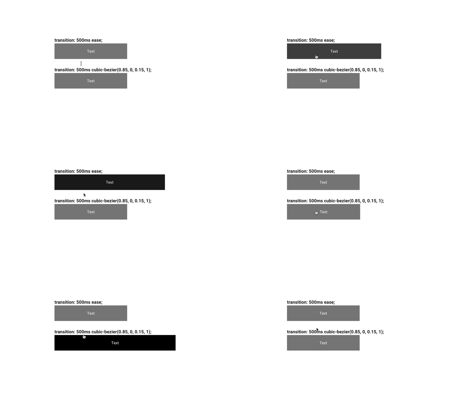
また、steps()関数というコマ送りのようなアニメーションを指定することもできます。
.transition-timing-function3 {
  transition: 500ms steps(3, end);
}
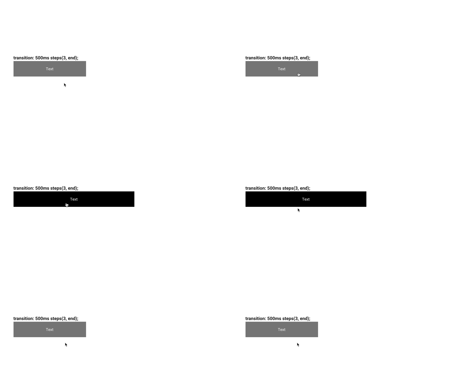
ヒント:イージングはアニメーションの印象を左右する
加速と減速を使い分けることでアニメーションに「自然らしい動き」を適用できます。また、加速と減速は強度によってその印象が変わってきます。cubic-bezier()を使うと細部を調整できますが、何を基準に選べばいいか判断に悩むことでしょう。
ウェブサイトの世界観や雰囲気にもよりますが、多くの場合ではデフォルトのeaseでも十分な印象となります。ease-inやease-outは強度が低いので、あまり自然な動きにならず、のっぺりした印象となるでしょう。あまり難しいことは考えず、easeを選択するのがいいと思います。
こだわる場面で、『Easings - Generate Cubic Bezier Easing Curves』などのサイトを参考にcubic-bezier()のパラメーターを設定するといいでしょう。上級者の観点では後日公開予定のマイクロインタラクション(仮)の解説をお待ちください。
transition-delayプロパティ
transition-delayプロパティはアニメーションが開始されるまでの待ち時間を指定できます。transition-propertyプロパティと組み合わせるとプロパティ毎に待ち時間の指定ができます。
<button class="transition-delay">Text</button>
<button class="transition-delay2">Text</button>
/* 共通のスタイル*/
button {
  width: 300px;
  background-color: gray;
  padding-top: 15px;
  padding-bottom: 15px;
  color: #fff;
  border: none;
}
/* ホバー時のスタイル*/
button:hover {
  width: 500px;
  background-color: black;
}

.transition-delay {
  /* 時間 | イージング | 待ち時間 */
  transition: 500ms ease 500ms;
}

.transition-delay2 {
  /* 複数のプロパティ指定 プロパティ | 時間 | イージング | 待ち時間 , プロパティ | 時間 | イージング | 待ち時間 */
  transition: width 500ms ease 500ms, background-color 500ms ease 1s;
}
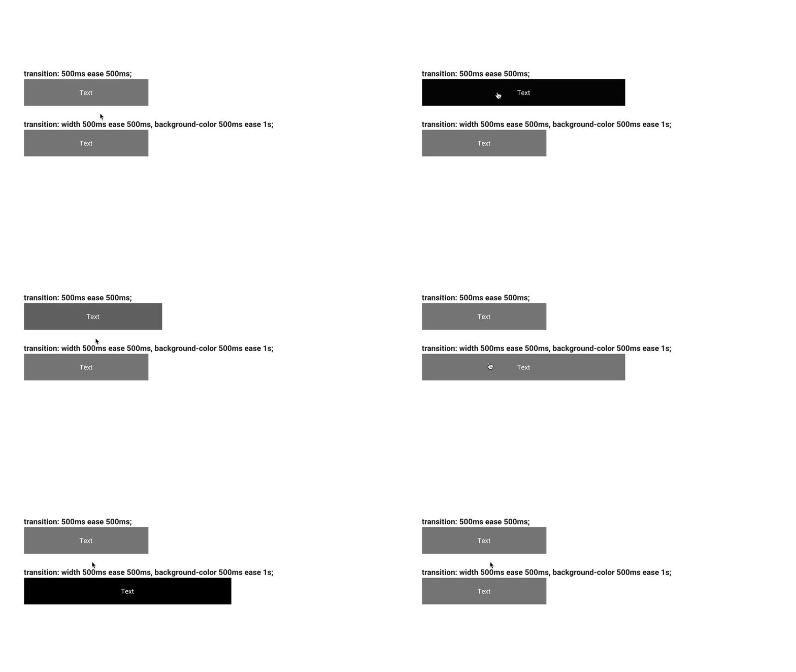
プロパティ毎の待ち時間をズラすことで、横幅のアニメーションが終了してから背景色を変更するというアニメーションになっています。
まとめ
今回のレッスンではアニメーションの設定を行うtransitionプロパティについて学びました。その機能をまとめて振り返ってみましょう。
transitionプロパティはショートハンドプロパティでした。
transition-property: どのプロパティに適用させるかの指定transition-duration: アニメーション時間の指定transition-timing-function: イージング(動きの加減速)の指定transition-delay: アニメーション開始までの待ち時間の指定
transitionプロパティはこれらをまとめて記述できます。
.button {
  /* プロパティ | 時間 | イージング | 待ち時間 */
  transition: all 500ms ease 500ms;
}
もちろん、それぞれのプロパティを個別に記述することもできます。transitionプロパティを使いまとめて記述することが多いですが、場面によっては個別で書いた方が分かりやすい時もあるので使い分けていきましょう。
.button {
  transition-property: all;
  transition-duration: 500ms;
  transition-timing-function: ease;
  transition-delay: 500ms;
}
次回のレッスンでは、本レッスンで学んだtransitionプロパティを活用して実際にアニメーションを作成していきましょう。